

brand Identity, website, marketing templates
Lead Designer
Logo
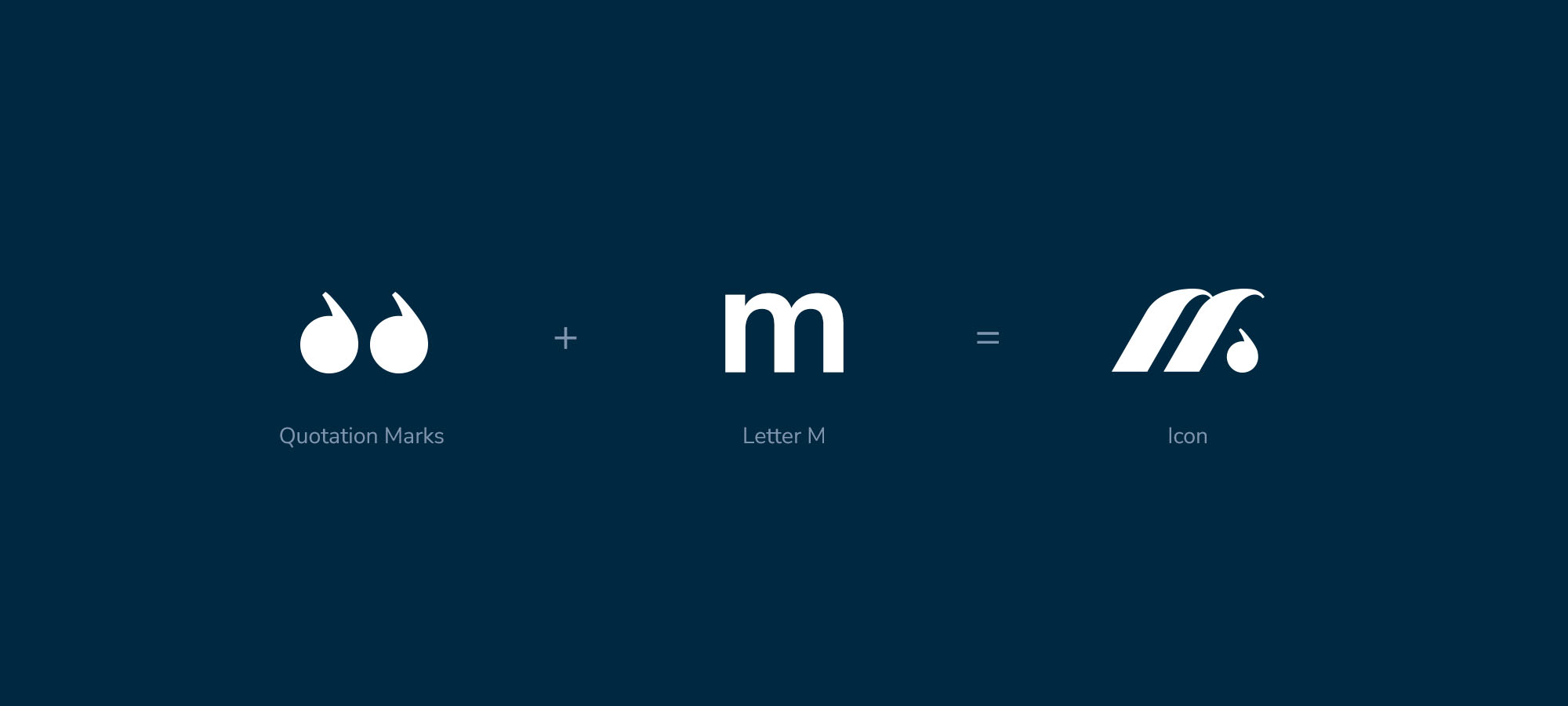
The icon is a dynamic letter “M” with a subtle nod to storytelling, expressed through a punctuation-inspired detail. The primary logo’s letterforms were carefully rounded to create a softer, more approachable feel that complements the icon. The result is a modern, approachable logo that conveys a sense of movement which were key themes of the visual rebrand.
Sleek & Sophisticated
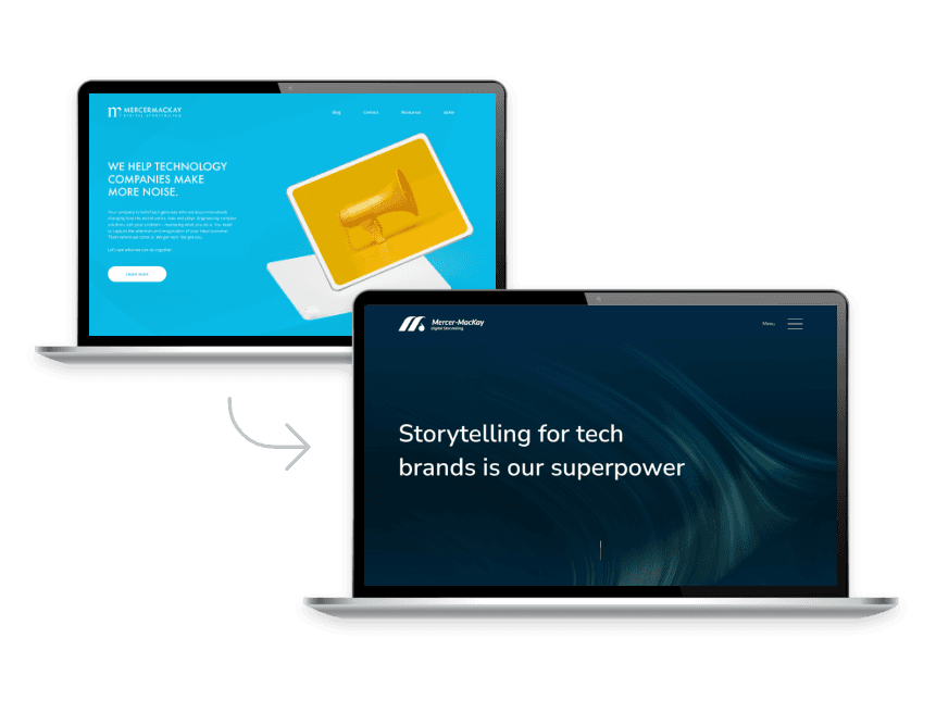
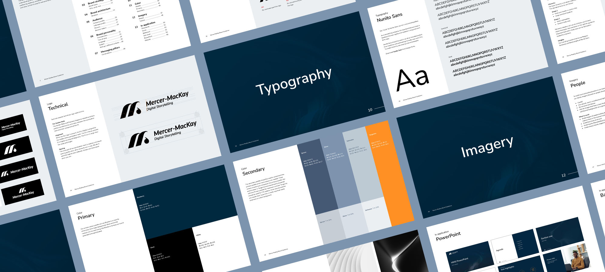
The new brand opts for monochromatic blue-grey tones with orange accents. Darker blues represent reliability and strength, while orange reflects optimism and friendliness.
To elevate the typography, we established strong hierarchy and introduced a new brand typeface. As a storytelling company, it’s important we chose a typeface that was legible and readable in long and short form copy. Nunito Sans does just that. We opened up the leading to create more white space and enhance the visual appeal for a sophisticated look.
Digital Presence
The aim was to create a more immersive and dynamic digital experience, using micro animations and subtle movement to guide users intuitively through the site. Custom imagery was developed to reflect the brand’s personality and elevate visual storytelling, while thoughtful UX improvements ensure content is easy to navigate and engaging across devices.
A dedicated case study section brings the work to life, showcasing real outcomes through client testimonials, video content, and curated project examples. The new site tells a compelling narrative of the brand’s impact.


